Sunday, March 23, 2008

Color Interaction

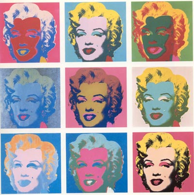
When one color interacts with one another, it changed our perception accordingly. We can absorb this fact clearly with interior design. As color is the fastest, cheapest and easiest way to transform a room. Color and pattern can visually adjust actual space.

For example, we can see the color strip on the room enlarged the room space from our vision. The compliment color also enlightens the room into an elegant, playful, and light atmosphere.


The strip dinner table cloth increases the actual table length visionary. The color chose of the strip is in simultaneous contrast decrease the interval of the table and the wall. As learning and understanding more about color theory, it truly helps my palate and taste to apply in daily life.

citation:
https://blogger.googleusercontent.com/img/b/R29vZ2xl/AVvXsEgKDSAPh4esA54je_IXA7uB-bvxofKG9lqJNxQMTcFLMTPn6RTCfibcCdo8-FKDOzGvLfkvt-cbx591b06zsm20eWvYlEIo5M0rwdX5PqhfiTIuIyB_IJE208BtUWY4bg-Nd_grt44W30wJ/s1600-h/untitled.bmp
http://todaysfacilitymanager.com/facilityblog/uploaded_images/table-724781.jpg

Wednesday, March 19, 2008

Chromatic Gray Study


Silver is the metallic shade resembling gray, closest to that of polished silver. In today’s society, silver car could be seen as a majority in a parking lot.

So what makes silver such a popular car color?

I read an article about how social mood influences the car colors people prefer. Silver became an absolute dominance of car color since 1998. The color has less precedence than others as a meter of social mood. Color consultant Leatrice Eiseman says that silver is “elegant, loves futuristic looks, cool.” I think silver satisfy people’s complacency of impression and social status as well.

While silver continues its six-year reign as the number one color choice, it continues to decline in popularity in favor of a fuller palette of true, high-chromatic colors. Silver is also giving way to its sister neutral color: medium dark gray. There is a complicated formulation that show color infusion of various color hues.

Gray does not have directional implications for social mood. However, color of gray for cars dilutes its brightness recently. It shows the decrease of the negative mood trend.

citation:
http://www.nca.ie/images_upload/nca_car.jpg
http://money.aol.com/insurancecom/insurance/canvas3/_a/what-does-your-car-color-say-about-your/20060830134109990001
http://www.infoplease.com/ipa/A0855652.html
http://www.elliottwave.com/features/default.aspx?cat=pmp&aid=2652

Friday, February 22, 2008

Application and Composition


http://www.lovecolors.net/wp-content/uploads/2007/12/andy-warhol-01.jpg

Andy Warhol was a central figure in the movement known as Pop Art. His most well known piece Marilyn Monroe arranged the color composition successfully.

The first box in the first row, Monroe has a red face and pink hair and red background which applied the monochrome. The first box in the third row, the blue facial features with orange hair applied the complement. The third box in the last row, natural skin color and blonde hair with pink background applied analogous.

Even though Warhol didn't use monochrome, complement, and analogous in order on each row of nine thumbnail boxes, but he still presented the organized color contrast.

The same portrait of Marilyn Monroe repeat in each box, but the color tone applied the atmosphere differently. We are able to see ill, happy, depressed, energetic, charming or serious Marilyn Monroe by the different color composition.

Thursday, February 14, 2008

Color Scale

Color Scale is an common presentation for statistics data. It is an useful tool in the term of color category and the visual appeal.


The nutrient chart uses monochrome color to identify the gradual change among the years by light blue to dark blue.

http://www.fao.org/docrep/006/y5066e/y5066e0h.jpg


The climate chart uses complement color to show the weather change.
http://genetics.forestry.ubc.ca/twang/climate_modeling_files/image005.jpg

The color scale applies to the data successfully because we view the pleasant logical change of color. The data also can use the color to distinguish information. For example, the darker color may represent danger zone or heavier weight, and light color stand for safety zone or lighter weight.

Wednesday, February 6, 2008

Color Wheel

We are able to see the color wheel in our daily life.

http://sparklette.net/archives/651/ferris.jpg ; http://www.geekologie.com/2007/10/31/ferris-wheel-phone.jpg

Left hand ferry wheel represented the gradual changing color by light. The glamorous color shined enchanting which also brightened the dull dark night. Right hand ferry used the cable car to display the color.


The wind wheel characterized its fan as the color wheel. I can imagine that it will spin the color magically into a rainbow. http://www.lawnornamentsandfountains.com/productimages/07smc/33333-b.gif

I also see other merchandise using the color wheel to illustrate their products. Society likes to use color wheel to demonstrate the object because the various color give viewer the vivid vision and impressive image. The primary color also support the product easily to categories into different parts, for example, the bigger points showed in primary color in a "gambling win a spin."

From the following examples I learned that painting medium such as acylic is not the only tool to create color wheel. In addition, while studying the color in color wheel, I alsorealized that I didn't only learn the color theory academically. The color wheel also apply in society to lighten our heart visionary.

Thursday, January 24, 2008

Color Context

Orange is the color of sun, and the meaning of warmth. The Hershey's Reese's is the chocolate contain peanut butter, which is interesting that they didn't use brown to present product's image. This logo use slightly yellow, yellow is the second alarming color beside red. Therefore, the color grabs viewers' attentions. As a sunny orange represent the chocolate, customers get the imagination of melting. The chocolate is melting in our mouth, it warm our heart and we taste the happiness.

Most girls like pink, this color reflects their energy and youth. This light pink baby lotion emphasize on woman's tender femininity. This pink color is gentle, which imply that the lotion is soft as this baby pink, and our skin can easily absorb it with a gentle touch. The baby lotion is smooth, this color also fit with the product's smoothness, although the lotion is white in fact. The baby blue label color mentioned that lotion is liquid. The choice of this pink color pleased customers with imaginary satisfaction.

Both color promote the products' image successfully. Even though the color doesn't attach to the products' original color.

Sunday, November 18, 2007

Conceptual Art Activity

Everyone draw a different line on a sheet of paper and put them together. When the whole piece finished, I was so surprised seeing that all the random shape form into a organized, logical and order piece. It is way beyond my expectation to see the result, because originally I thought it just wouldn’t connect together during the process. Organized and ordered piece could be developed by disorder random thing.