Sunday, March 23, 2008

Color Interaction

When one color interacts with one another, it changed our perception accordingly. We can absorb this fact clearly with interior design. As color is the fastest, cheapest and easiest way to transform a room. Color and pattern can visually adjust actual space.

For example, we can see the color strip on the room enlarged the room space from our vision. The compliment color also enlightens the room into an elegant, playful, and light atmosphere.


The strip dinner table cloth increases the actual table length visionary. The color chose of the strip is in simultaneous contrast decrease the interval of the table and the wall. As learning and understanding more about color theory, it truly helps my palate and taste to apply in daily life.

citation:
https://blogger.googleusercontent.com/img/b/R29vZ2xl/AVvXsEgKDSAPh4esA54je_IXA7uB-bvxofKG9lqJNxQMTcFLMTPn6RTCfibcCdo8-FKDOzGvLfkvt-cbx591b06zsm20eWvYlEIo5M0rwdX5PqhfiTIuIyB_IJE208BtUWY4bg-Nd_grt44W30wJ/s1600-h/untitled.bmp
http://todaysfacilitymanager.com/facilityblog/uploaded_images/table-724781.jpg

Wednesday, March 19, 2008

Chromatic Gray Study


Silver is the metallic shade resembling gray, closest to that of polished silver. In today’s society, silver car could be seen as a majority in a parking lot.

So what makes silver such a popular car color?

I read an article about how social mood influences the car colors people prefer. Silver became an absolute dominance of car color since 1998. The color has less precedence than others as a meter of social mood. Color consultant Leatrice Eiseman says that silver is “elegant, loves futuristic looks, cool.” I think silver satisfy people’s complacency of impression and social status as well.

While silver continues its six-year reign as the number one color choice, it continues to decline in popularity in favor of a fuller palette of true, high-chromatic colors. Silver is also giving way to its sister neutral color: medium dark gray. There is a complicated formulation that show color infusion of various color hues.

Gray does not have directional implications for social mood. However, color of gray for cars dilutes its brightness recently. It shows the decrease of the negative mood trend.

citation:
http://www.nca.ie/images_upload/nca_car.jpg
http://money.aol.com/insurancecom/insurance/canvas3/_a/what-does-your-car-color-say-about-your/20060830134109990001
http://www.infoplease.com/ipa/A0855652.html
http://www.elliottwave.com/features/default.aspx?cat=pmp&aid=2652

Friday, February 22, 2008

Application and Composition


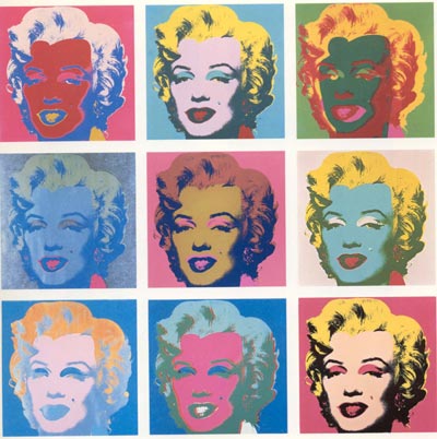
http://www.lovecolors.net/wp-content/uploads/2007/12/andy-warhol-01.jpg

Andy Warhol was a central figure in the movement known as Pop Art. His most well known piece Marilyn Monroe arranged the color composition successfully.

The first box in the first row, Monroe has a red face and pink hair and red background which applied the monochrome. The first box in the third row, the blue facial features with orange hair applied the complement. The third box in the last row, natural skin color and blonde hair with pink background applied analogous.

Even though Warhol didn't use monochrome, complement, and analogous in order on each row of nine thumbnail boxes, but he still presented the organized color contrast.

The same portrait of Marilyn Monroe repeat in each box, but the color tone applied the atmosphere differently. We are able to see ill, happy, depressed, energetic, charming or serious Marilyn Monroe by the different color composition.

Thursday, February 14, 2008

Color Scale

Color Scale is an common presentation for statistics data. It is an useful tool in the term of color category and the visual appeal.


The nutrient chart uses monochrome color to identify the gradual change among the years by light blue to dark blue.

http://www.fao.org/docrep/006/y5066e/y5066e0h.jpg


The climate chart uses complement color to show the weather change.
http://genetics.forestry.ubc.ca/twang/climate_modeling_files/image005.jpg

The color scale applies to the data successfully because we view the pleasant logical change of color. The data also can use the color to distinguish information. For example, the darker color may represent danger zone or heavier weight, and light color stand for safety zone or lighter weight.

Wednesday, February 6, 2008

Color Wheel

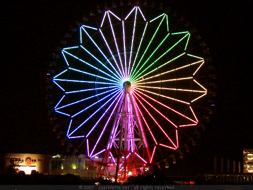
We are able to see the color wheel in our daily life.

http://sparklette.net/archives/651/ferris.jpg ; http://www.geekologie.com/2007/10/31/ferris-wheel-phone.jpg

Left hand ferry wheel represented the gradual changing color by light. The glamorous color shined enchanting which also brightened the dull dark night. Right hand ferry used the cable car to display the color.


The wind wheel characterized its fan as the color wheel. I can imagine that it will spin the color magically into a rainbow. http://www.lawnornamentsandfountains.com/productimages/07smc/33333-b.gif

I also see other merchandise using the color wheel to illustrate their products. Society likes to use color wheel to demonstrate the object because the various color give viewer the vivid vision and impressive image. The primary color also support the product easily to categories into different parts, for example, the bigger points showed in primary color in a "gambling win a spin."

From the following examples I learned that painting medium such as acylic is not the only tool to create color wheel. In addition, while studying the color in color wheel, I alsorealized that I didn't only learn the color theory academically. The color wheel also apply in society to lighten our heart visionary.

Thursday, January 24, 2008

Color Context

Orange is the color of sun, and the meaning of warmth. The Hershey's Reese's is the chocolate contain peanut butter, which is interesting that they didn't use brown to present product's image. This logo use slightly yellow, yellow is the second alarming color beside red. Therefore, the color grabs viewers' attentions. As a sunny orange represent the chocolate, customers get the imagination of melting. The chocolate is melting in our mouth, it warm our heart and we taste the happiness.

Most girls like pink, this color reflects their energy and youth. This light pink baby lotion emphasize on woman's tender femininity. This pink color is gentle, which imply that the lotion is soft as this baby pink, and our skin can easily absorb it with a gentle touch. The baby lotion is smooth, this color also fit with the product's smoothness, although the lotion is white in fact. The baby blue label color mentioned that lotion is liquid. The choice of this pink color pleased customers with imaginary satisfaction.

Both color promote the products' image successfully. Even though the color doesn't attach to the products' original color.

Sunday, November 18, 2007

Conceptual Art Activity

Everyone draw a different line on a sheet of paper and put them together. When the whole piece finished, I was so surprised seeing that all the random shape form into a organized, logical and order piece. It is way beyond my expectation to see the result, because originally I thought it just wouldn’t connect together during the process. Organized and ordered piece could be developed by disorder random thing.

Monday, November 12, 2007

Performing Art


Instructions:
Two participants bounce the ball without looking at it, and go around within a circle.

The Response:
Originally I was thinking about an idea that how people can involved within the space. Are we living in space or are we dominating the space? During the time Lindsey and Pavlos performed my assignment, I observed the new thing which is the speed of bouncing ball, performers walking in circle and space dimension work cooperatively together.

Cortlandt’s project:
It’s a fun activity that traces my hand and Lindsay’s hand with closing eyes. I accidentally try to stab Lindsay’s land for finding her hand without thinking.

Tyson’s project:
It’s hard to tie a knot with one hand. I wouldn’t thinking myself as a string to tie a knot.

Gutai


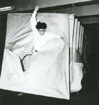
The Gutai group was an artistic movement and association of artists founded Jiro Yoshihara. It considered to be akin to Abstract Expressionism, were pioneers of later directions in art such as "Happening" performance art, "Environmental Art" and “Conceptual Art”. In 1955, an artist Murakami created his reportedly stunning performance Laceration of Paper, in which he ran through a paper screen. (Image)

By studying Gutai’s art achievement, it offers me a unique perspective on the international dynamics of postwar. It also gives audiences a fascination with the beauty that arises when things become damaged or decayed. The process of damage or destruction is celebrated as a way of revealing the inner "life" of a given material or object.

It would be fun to witness any performing artist’s work at the frist place to see their development.

image: http://nezumi.dumousseau.free.fr/japon/j2/japarmurakami2.jpg
http://en.wikipedia.org/wiki/Gutai_group
http://www.tate.org.uk/collections/glossary/definition.jsp?entryId=130

Monday, November 5, 2007

Kaprow


In this shadow activity, we need to be silent and use rock to communicate. One person follows leader’s shadow, and if you stepped out of the shadow, we make a noise by hitting the two rocks. I had a hard time to follow Kayla’s shadow; she skipped, jumped, and made several sudden movements then I was totally out of the track. Sometime I even forgot to the hit the rock. This assignment makes me understand more about performing art when I involved to it. Art could be a silent communication to connect artist and audiences.

image: http://images.jupiterimages.com/common/detail/18/08/23380818.jpg

Sunday, October 21, 2007

Logo


A logo is important to attract customers’ attention with the product’s symbol. In order to remain the strong impression to customers, the logo must be easy to recognize with the font, color and frame. The logo also demonstrates company’s reputation, history, royalty and admiration.

M&M’s logo have various different colors refer to its colorful chocolate.
A sign - a thing whose presence or occurrence indicates the probable presence, occurrence, or advent of something else
A symbol - a material object representing something, often something immaterial
An icon - a sign or representation that stands for its object by virtue of a resemblance or analogy to it
A logo - a graphic representation or symbol of a company name, trademark, abbreviation, etc., often uniquely designed for ready recognition
(Dictionary.com)

"The Bride Stripped Bare by Her Bachelors, Even"


When I first looked at Duchamp’s “The Bride Stripped Bare by Her Bachelors, Even”, I immediately felt confused about those irrelevant object on the painting. Until we read Duchamp’s note, I can finally realized about the concept and meaning that artist define. The painting has a horizontal line divided the piece into two panel. Everything connects to each other as a sequent motion. In order to see bride and bachelor, we have to analyze the notes deeply with the space and theme deeply. The top rectangle is known as the Bride's Domain; the bottom piece is the Bachelors' outfit. Duchamp profiles them into mechanical abstract object. The composition's most dominating feature of physic and dimension. It is an unique and thoughtful piece.

Saturday, October 20, 2007

Patterns in Repetition


Islamic patterns form of geometric shapes, and mostly pentagon. They expand their pattern by spreading the petals. Islamic art mainly pertain to religion purpose. The meaning beyond the repetition of element is to gorify Islamic art as the transcendent, indivisible and infinite nature of Alah.


Sunday, October 14, 2007

Sunday, October 7, 2007

Gestalt


Gestalt is a German word that can be translated into English in various ways:
- as shape, form, guise or likeness

(e.g., in Menschengestalt: in human form)
- as figure
or as a synonym for person
(e.g., eine dunkle Gestalt: a sinister figure)
- A collection of physical, biological, psychological or symbolic entities that creates a unified concept, configuration or pattern which is greater than the sum of its parts.

Tuesday, September 18, 2007

String

String project is a fun activity to experience the line dimension. We often interpret that line is a form traced on the surface. In this String project, I realized that the line can create the space amazingly into an art.
There was some painful positions we have to get through the negative space of strings. In the end, we all entangled in strings of untangling it.

Monday, September 17, 2007

Line>Shape

1. b and c are lines

2. a,b,c,d are all shapes

3. line is a form developes freely of straight/curved, thin/thick, long/short mark

4. shape is a 2 dimension figure formes by line

Monday, September 10, 2007

Titian's Venus of Urbino

Describe:
The woman is the center of this painting.The image of her leaning elegantly on the bed formed a triangle shape.Line above her left hand divided the background vertically into two themes.
The black background on the left side made her stands out like a portrait painting.On the other side, viewers can easily distinguish woman from room clearly.


Interpret:
Tone of this piece is tranquil. The use of color of whole piece is warm.
Woman is Venus who had the attractive face and plump figure and she looked fascinated straightly to viewers.
Her two servants were busy on back preparing the cloth for her.
Sleeping dog also created a peaceful relaxing mood.


Evaluate:
I think it is a great piece illustrated Venus’s character beautifully.
Venus is the main focus of the painting; the white quilt also implied her purity.